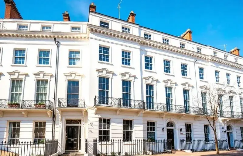
Selecting the perfect palette for a period property in Chelsea is more than a simple aesthetic choice; it is an act of historical stewardship. From the grand stucco-fronted townhouses of Belgravia to the charming red-brick terraces of the Royal Borough, the architecture of Central London demands a nuanced approach to colour. The way light hits a Victorian bay window on a crisp morning differs significantly from how it reflects off a contemporary apartment, and in a heritage-rich area like Chelsea, the stakes are exceptionally high.
At coreMaint, we understand that owners of these prestigious homes are looking to balance timeless elegance with modern sensibilities. A well-chosen colour scheme doesn't just improve your daily living environment; it preserves the character of the building and can significantly enhance the market value of the property. With Chelsea’s property prices remaining among the highest in the world, ensuring your interior and exterior maintenance is handled with expert care is a vital investment.
In this guide, we will explore the intricate process of selecting paint colours that honour the architectural bones of your Chelsea home while reflecting your personal style. Whether you are refreshing a Grade II listed building or modernising a lateral conversion, these professional insights will help you navigate the world of heritage hues.
Understanding the Architecture of Chelsea and Central London
Before picking up a brush, one must understand the era of their property. Chelsea is a tapestry of architectural history, featuring everything from Queen Anne styles to late-Victorian and Edwardian builds. Each of these eras had a specific "logic" regarding colour, often dictated by the pigments available at the time.
The Georgian Influence (1714–1837)
Georgian interiors in Central London were often surprisingly bold. While we often think of "Georgian Grey," the era actually favoured earthy tones like ochre, terracotta, and deep burgundy for dining rooms, while drawing rooms often featured lighter "sky" blues or soft greens. If your Chelsea townhouse features high ceilings and ornate cornicing, these classical colours can highlight the symmetry that defines the period.
The Victorian Flourish (1837–1901)
As the industrial revolution progressed, more synthetic pigments became available. Victorian homes in South London often embraced deeper, moodier tones. Think forest greens, deep crimsons, and navy blues. These colours were practical, hiding the soot from coal fires, but today they offer a sense of "cocooning" luxury that works beautifully in study areas or master bedrooms.
Edwardian Light (1901–1910)
Edwardian architecture moved away from the heavy Victorian clutter towards lighter, airier spaces. This is the era of pastels—soft lilacs, primrose yellows, and duck-egg blues. If you live in an Edwardian conversion near Sloane Square, these shades can help maximise the natural light that these properties are famous for.
The Science of Light in London Homes
One of the most common mistakes homeowners make is choosing a colour from a swatch in a showroom, only to find it looks completely different on their walls. In Chelsea, the quality of light is influenced by the proximity to the River Thames and the height of surrounding buildings.
Facing the Compass
- North-Facing Rooms: These rooms receive a cool, bluish light. Avoid cool greys or crisp whites, as they can make the room feel clinical and cold. Instead, opt for "warm" neutrals with yellow or red undertones to bounce warmth around the space.
- South-Facing Rooms: These are a decorator's dream, bathed in strong light throughout the day. You can get away with almost any colour here, but soft "cool" tones like pale blues or teals can help balance the intensity of the sun.
- East and West-Facing Rooms: The light will change dramatically throughout the day. An east-facing kitchen will be bright in the morning but shadowy by tea time. Always test your paint samples at different hours to ensure you love the colour in every light.
The "London Grey" Factor
London’s weather is famously overcast. To combat the "grey" days, many coreMaint clients are moving away from stark "Brilliant White" ceilings. Instead, we often recommend "Off-White" or "Cream" finishes. These provide a softer transition between the walls and the ceiling, preventing the stark contrast that can make a room feel smaller.
Contact Us to discuss how we can help you choose the perfect finish for your specific light conditions.
Selecting a Palette: A Step-by-Step Guide
Navigating thousands of shades from premium brands like Farrow & Ball, Little Greene, or Edward Bulmer can be overwhelming. Here is the professional process we recommend for our Chelsea property maintenance projects:
- Start with the "Fixed" Elements: Before choosing paint, look at your flooring, marble fireplaces, and existing cabinetry. Your paint should complement these permanent features, not fight them.
- The Rule of Three: Limit your palette for a single room to three main colours: a dominant wall colour (60%), a secondary colour for trim and doors (30%), and an accent colour for features (10%).
- Consider the Flow: In a period property, rooms are often connected by grand hallways. Ensure there is a "red thread" of colour that connects the spaces so the house feels like a cohesive home rather than a collection of disjointed rooms.
- Don't Forget the Woodwork: In Chelsea’s traditional homes, the trend is shifting away from white gloss skirting boards. Many designers now paint the skirting, architraves, and walls in the same colour (the "colour drenching" technique). This creates a contemporary, seamless look that makes the ceilings appear higher.
External Excellence: The Chelsea Curb Appeal
In areas like Knightsbridge and Chelsea, the exterior of your property is a statement. Many properties are subject to Royal Borough of Kensington and Chelsea (RBKC) planning restrictions, especially in conservation areas.
- Stucco Fronts: Most require specific shades of cream or "Portland Stone" to maintain the street's uniform aesthetic.
- Front Doors: This is where you can show personality. A high-gloss black is a timeless Central London classic, but deep "Hague Blue" or "Racing Green" are becoming increasingly popular for Chelsea boutiques and residences.
Get a Free Quote for your exterior painting and masonry needs.
Essential Practical Tips for Period Painting
Painting a period property is not just about the colour; it’s about the preparation and the type of paint used.
- Breathability is Key: Older buildings were designed to breathe. Using modern, plastic-based masonry paints on old brickwork can trap moisture and lead to damp. We recommend lime-based paints or specialist mineral paints for heritage brickwork.
- Acoustic Considerations: If your property is near a busy Chelsea thoroughfare, certain high-quality paints have thicker pigments that can marginally help with sound softening when applied over heavy-duty lining paper.
- Finish Matters:
- Estate Emulsion/Flat Matt: Best for walls to hide imperfections in old plaster.
- Eggshell: Ideal for woodwork and kitchens as it is wipeable but not overly shiny.
- Full Gloss: Stunning on front doors, but requires a perfectly smooth surface as it highlights every bump.
Why Professional Execution Matters
A premium property in South London deserves a premium finish. While DIY is an option for some, the intricate mouldings, high ceilings, and delicate plasterwork of Chelsea homes require a professional hand.
According to recent real estate data, a professionally decorated home in Central London can see an uplift in valuation of up to 5-10% compared to properties with poor maintenance or dated palettes. Furthermore, professional painters like the team at coreMaint ensure that lead-testing is conducted on old paint layers and that all surfaces are properly stabilised before the first drop of colour is applied.
Conclusion
Choosing paint colours for your Chelsea home is a journey through history, light, and personal expression. By respecting the architectural heritage of your property while embracing modern colour theories, you can create a space that feels both timeless and fresh. Remember to always test your samples, consider the orientation of your rooms, and never underestimate the power of a perfectly painted skirting board.
At coreMaint, we specialise in the upkeep and aesthetic enhancement of London’s finest homes. From meticulous interior decorating to essential exterior maintenance, our team is dedicated to preserving the beauty of Chelsea and South London’s residential landscape.
Ready to transform your home with a professional touch?
Get a Free Quote today or Contact Us to speak with one of our property maintenance experts about your next project. Let coreMaint bring your vision to life with the precision and quality your property deserves.