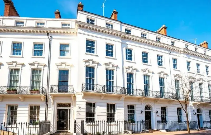
Standing before a Grade II listed townhouse in the heart of Chelsea, one cannot help but be struck by the weight of history. From the red-brick Queen Anne style residences near Sloane Square to the iconic stucco-fronted terraces of the Boltons, Chelsea’s architecture is a testament to London’s storied past. However, for the modern homeowner, this architectural heritage presents a unique challenge: how do you select a colour palette that respects the property’s historical integrity while reflecting contemporary sophistication?
Choosing the right paint for a period property in Central London is not merely an aesthetic decision; it is an act of preservation. The light in London is famously mercurial, shifting from grey and diffused to brilliant gold across the Thames in a matter of minutes. This, combined with the strict regulations often imposed by the Royal Borough of Kensington and Chelsea (RBKC) planning department, means that a DIY approach often falls short of the mark.
At coreMaint, we have spent years refining the art of property maintenance and decoration in South London’s most prestigious postcodes. We understand that a Chelsea home requires a nuanced approach—one that balances the demands of conservation with the comforts of a premium lifestyle. In this guide, we will explore the historical context of London’s colour palettes and provide actionable advice on selecting the perfect hues for your period home.
Understanding the Architectural Heritage of Chelsea
To choose the right colour, one must first understand the era of the building. Central London is a patchwork of architectural movements, and each has a specific "colour vocabulary."
The Georgian Elegance (1714–1837)
Georgian architecture is defined by symmetry and proportion. During this period, pigments were expensive and derived from natural earths. If you own a Georgian property near Cheyne Walk, you should look toward muted, "stony" palettes. Think off-whites, soft greys, and pale ochres. For exteriors, the classic "Chelsea White"—a creamy, warm off-white—remains the gold standard for masonry.
The Victorian Vibrancy (1837–1901)
As the Industrial Revolution progressed, synthetic pigments became available, allowing for deeper, richer tones. Victorian homes often feature intricate plasterwork and high ceilings. Deep crimsons, forest greens, and navy blues were popular for dining rooms and libraries, creating a sense of intimacy and grandeur.
The Edwardian Airiness (1901–1910)
Edwardian properties, frequently found in the leafy pockets of South London and towards Greenwich, moved away from Victorian heaviness. There was a shift towards floral motifs and lighter, fresher colours—primrose yellows, sage greens, and soft duck-egg blues.
The Science of Light in Central London
One of the most common mistakes homeowners make is choosing a paint colour based on a small swatch viewed in a showroom. The way a colour behaves in a Knightsbridge showroom is vastly different from how it will look in a north-facing basement flat in Chelsea.
Evaluating Natural Light
- North-Facing Rooms: These rooms receive a cool, consistent light that can make grey or blue tones feel chilly. To counteract this, opt for colours with yellow or red undertones to add warmth.
- South-Facing Rooms: These are a decorator's dream, bathed in warm light for most of the day. Here, you can experiment with cooler tones like pale blues or crisp whites without them feeling clinical.
- East and West Facing: These rooms change dramatically throughout the day. A west-facing room might look dull in the morning but glow with orange hues in the late afternoon. Always test your samples at different times of the day.
The Importance of "Light Reflectance Value" (LRV)
In dense urban environments like Central London, where buildings are often close together, maximizing light is crucial. LRV measures the percentage of light a paint colour reflects. A high LRV (near 100) is white, while a low LRV (near 0) is black. For hallways and landings in period properties, we often recommend colours with an LRV of 60 or higher to keep the space feeling open and airy.
If you are unsure how the light in your property will interact with your chosen palette, you can Contact Us for a professional consultation.
Expert Tips for Selecting Interior Palettes
When decorating a premium property, the goal is to create a cohesive flow between rooms while highlighting original features like cornicing, dado rails, and ceiling roses.
1. The Three-Colour Rule
For period rooms, we recommend a three-colour approach:
- The Main Wall Colour: This sets the mood of the room.
- The Woodwork: Traditionally, skirting boards and door frames were painted darker than the walls to hide scuffs, but modern trends favour painting them the same colour as the walls (colour drenching) to make the room feel larger.
- The Ceiling and Cornice: Never use a basic "brilliant white" on a period ceiling. It is too harsh. Instead, use a "soft white" or a slightly lightened version of your wall colour to soften the transition.
2. Highlighting Architectural Details
Chelsea homes are renowned for their exquisite plasterwork. To make these features pop:
- Use a flat matt finish for walls to hide imperfections in old plaster.
- Use a subtle eggshell or satin finish for cornices to catch the light.
- Consider a "tonal" approach—painting the walls a mid-grey and the cornicing a very pale grey to highlight the craftsmanship without the starkness of white.
3. Don't Ignore the Flooring
The honey-coloured oak floors or original Victorian tiles in your hallway will reflect their own colours onto your walls. A warm wood floor will make a cool blue paint look slightly more violet. Always place your paint samples next to your flooring before making a final decision.
Get a Free Quote for your interior painting project today.
Exterior Excellence: Curb Appeal in the Royal Borough
In Chelsea, the exterior of your property is not just your own—it is part of a historic streetscape. Maintaining the aesthetic harmony of the neighbourhood is essential, and in many cases, legally required.
Navigating Conservation Area Restrictions
Many parts of Chelsea and Mayfair fall under conservation areas. This means you may be restricted in your choice of exterior colours.
- Stucco Fronts: Most stucco-fronted terraces are required to be painted in specific shades of cream or off-white.
- Front Doors: This is where you can often express personality. Deep gloss blacks, "Down Pipe" greys, or even a classic British racing green are timeless choices for a Chelsea townhouse.
- Ironwork: Railings and balconies should almost always be finished in a high-quality soot-black gloss to maintain the traditional London look.
The Importance of Quality Materials
London’s air, while cleaner than in the past, still carries pollutants and moisture that can degrade exterior paint quickly. At coreMaint, we use premium, breathable paints specifically designed for historic masonry. These paints allow moisture to escape from the old brickwork, preventing dampness and peeling—a common issue in South London’s older building stock.
Why Professional Execution Matters
Selecting the perfect colour is only half the battle. In a period property, the preparation phase is the most critical part of the process. Years of previous paint layers, settling cracks, and delicate mouldings require a steady, expert hand.
According to industry data, over 70% of the longevity of a paint job is determined by the quality of the surface preparation. In Chelsea’s high-value properties, cutting corners on prep work can lead to costly repairs just a few years down the line.
Our team at coreMaint specializes in:
- Lead Paint Removal: Safe handling of historical paint layers.
- Sympathetic Plaster Repair: Restoring cracked cornices and lath-and-plaster walls.
- Precision Cutting-In: Ensuring sharp lines between walls, ceilings, and ornate woodwork.
- Specialist Finishes: From lime washes for breathability to high-gloss lacquers for modern luxury.
Conclusion
Choosing paint colours for a period property in Chelsea is a balancing act between honoring the past and embracing the present. By considering the architectural era, the unique London light, and the surrounding streetscape, you can transform your home into a masterpiece of timeless design.
Whether you are looking to refresh a single room in Kensington or undertake a full exterior restoration in Greenwich, coreMaint is here to ensure the finish is nothing short of perfection. Our team of skilled decorators understands the nuances of premium property maintenance in Central and South London.
Ready to revitalize your period home with a professional touch?
Get a Free Quote or Contact Us today to schedule a consultation with our expert team. Let us help you bring your vision to life with the precision and care your Chelsea property deserves.