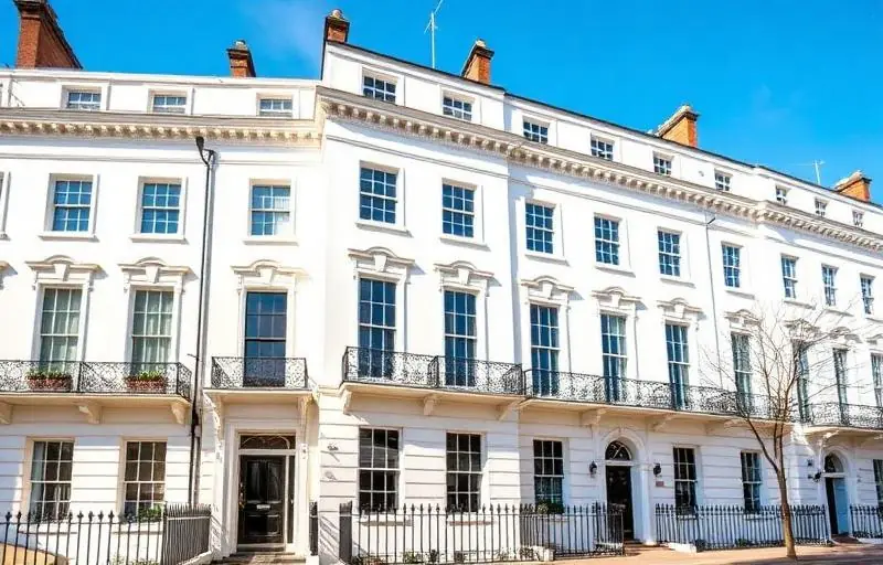
Walking through the tree-lined streets of Chelsea, from the red-brick grandeur of Cadogan Square to the pastel-hued cottages of Bywater Street, one thing becomes immediately clear: color is the soul of these historic neighborhoods. Choosing a color palette for a period property in Central London is not merely a matter of personal taste; it is an act of stewardship. Whether you own a Grade II listed Georgian townhouse or a refined Victorian terrace, the colors you select serve to bridge the gap between 18th-century heritage and 21st-century luxury.
For homeowners in SW3 and SW10, the stakes are uniquely high. The architecture here is world-renowned, and the wrong shade can unintentionally mask intricate plasterwork or clash with the iconic London stock brickwork. At coreMaint, we understand that painting a premium property in Chelsea requires more than a brush and a tin of paint; it requires an eye for historical accuracy, an understanding of the way Northern European light interacts with interiors, and a commitment to a flawless finish.
This comprehensive guide will walk you through the nuances of selecting paint colors that honor your home’s architectural DNA while ensuring it remains a comfortable, contemporary sanctuary. From navigating conservation area guidelines to choosing the right pigments for south-facing drawing rooms, here is how to master the art of color in Chelsea’s most prestigious postcodes.
Understanding the Architectural Heritage of Chelsea
Before opening a farrow & Ball color card, it is essential to understand the period of your property. Chelsea is a tapestry of architectural eras, each with its own traditional color vocabulary.
The Georgian Influence (1714–1830)
Georgian architecture, prominent around Sloane Square and the King's Road, is defined by symmetry and proportion. Original Georgian palettes were often surprisingly bold, featuring deep burgundies, forest greens, and rich blues. However, for a modern Chelsea interior, many homeowners opt for "stone" colors—muted greys, off-whites, and fawns—that reflect the understated elegance of the era.
The Victorian and Edwardian Eras (1837–1910)
Victorian properties, such as those found in the Boltons or near Chelsea Embankment, often feature more ornate detailing. This era embraced darker, more dramatic tones to showcase wealth and provide a backdrop for heavy furniture. Terracotta, deep navy, and sage greens are quintessential Victorian choices. Edwardian homes, by contrast, moved toward lighter, airier shades like duck-egg blue and primrose yellow to celebrate the influx of natural light.
The Science of Light in Central London
One of the most common mistakes homeowners make is choosing a color based on how it looks in a showroom. In Central London, the light is often described as "cool" or "greyish," which can drastically alter how a pigment behaves on your walls.
Managing North-Facing Rooms
Many townhouses in Chelsea feature rooms that face North, receiving little direct sunlight. In these spaces, cool greys or blues can end up looking chilly or even clinical. To counteract this, we recommend:
- Warm Neutrals: Choose whites with a yellow or red undertone to add an artificial warmth.
- Embracing the Dark: Sometimes, it is better to lean into the darkness with a rich, moody hue like a deep charcoal or hunter green, creating a cozy "snug" feel.
Maximizing South-Facing Brilliance
South-facing rooms are a gift, bathed in strong, warm light throughout the day. Here, you have more freedom. Cool tones like pale aqua or crisp, cool whites work beautifully to balance the heat of the sun, preventing the room from feeling "overheated" visually.
The Impact of Tall Windows
Chelsea properties are famous for their floor-to-ceiling sash windows. The sheer volume of light they let in means that colors will appear much lighter on the wall than on a small swatch. We always advise our clients to paint large sample patches on different walls to see how the color shifts from morning to dusk.
Get a Free Quote for a professional color consultation and site survey.
Choosing the Right Finish for Period Features
In a premium London home, the finish (or sheen level) is just as important as the color. Period properties often have imperfections in the plasterwork that come with age; the right finish can either hide these flaws or highlight the home’s character.
Matte and Chalky Finishes for Walls
For the main walls of a period property, a matte or "estate emulsion" finish is almost always the best choice. It offers a deep, velvety texture that absorbs light, hiding minor lumps and bumps in the old plaster. High-quality brands used by coreMaint provide excellent pigment depth in matte finishes, ensuring the color feels three-dimensional.
High-Gloss for Architectural Detail
In the grand hallways of Kensington and Chelsea, high-gloss finishes are making a comeback. Using a high-gloss paint on original woodwork, such as shutters, wainscoting, or a grand staircase, creates a stunning contrast against matte walls. It also adds a layer of durability to high-traffic areas.
The Iconic Chelsea Front Door
Your front door is the face your home presents to the world. In Chelsea, the trend remains classic:
- High-Gloss Black: The ultimate London staple, conveying authority and timelessness.
- Deep Navy or Royal Blue: A nod to the maritime history of the Thames nearby.
- Heritage Greens: Perfect for properties with small front gardens or window boxes.
Practical Steps to a Successful Painting Project
Selecting the color is only half the battle. Achieving a premium finish in a historic building requires a methodical approach.
1. Survey the Substrate
Before painting, the walls must be meticulously prepared. In older Chelsea homes, this often involves repairing lath and plaster or treating damp issues that are common in properties near the river.
2. Consider Conservation Guidelines
If your property is Grade II listed or situated within one of Chelsea’s many conservation areas, there may be restrictions on the colors you can use for the exterior. It is always wise to consult with the Royal Borough of Kensington and Chelsea (RBKC) planning office or a professional maintenance firm like coreMaint before making drastic changes to the facade.
3. The "Flow" of the House
When choosing colors for a multi-story townhouse, consider the "sightlines." When you stand in the hallway, can you see into three different rooms? If so, those three colors need to harmonize. Using a consistent neutral on all hallways and landings helps to ground the home, allowing for bolder color choices within individual rooms.
Why Professional Application Matters
A DIY paint job may suffice for a modern flat, but a period property in Mayfair or Chelsea demands a level of craftsmanship that only comes with experience. According to industry data, high-quality professional painting can increase a property's perceived value by up to 5-10%, a significant figure in the Central London luxury market.
Professional decorators understand the "breathability" of paints—an essential factor for older buildings. Using modern, non-breathable paints on old brickwork can trap moisture, leading to structural issues. At coreMaint, we use traditional methods combined with premium, breathable paints to ensure your home remains healthy and beautiful for decades.
Contact Us today to discuss your upcoming project.
Elevating Your Chelsea Home with coreMaint
Choosing the right paint colors for a period property is a delicate balance of honoring the past while embracing the present. By considering the architectural era, the unique London light, and the quality of the finish, you can transform your Chelsea residence into a masterpiece of interior design.
At coreMaint, we specialize in the maintenance and restoration of premium properties across Central and South London. From the initial color consultation to the final stroke of the brush, our team provides a seamless, high-end service tailored to the needs of discerning homeowners in Chelsea, Knightsbridge, and beyond.
Our services include:
- Interior and Exterior Painting & Decorating
- Specialist Woodwork Restoration
- Plastering and Cornice Repair
- Historical Color Matching and Consultation
- Full Property Maintenance for Premium Estates
Don't leave your home’s aesthetic to chance. Trust the experts who understand the unique requirements of London’s finest postcodes.
Ready to revitalize your property? Get a Free Quote or Contact Us to speak with one of our specialists about your Chelsea home today.